It all begins with an idea. Here are ours.
*
It all begins with an idea. Here are ours. *
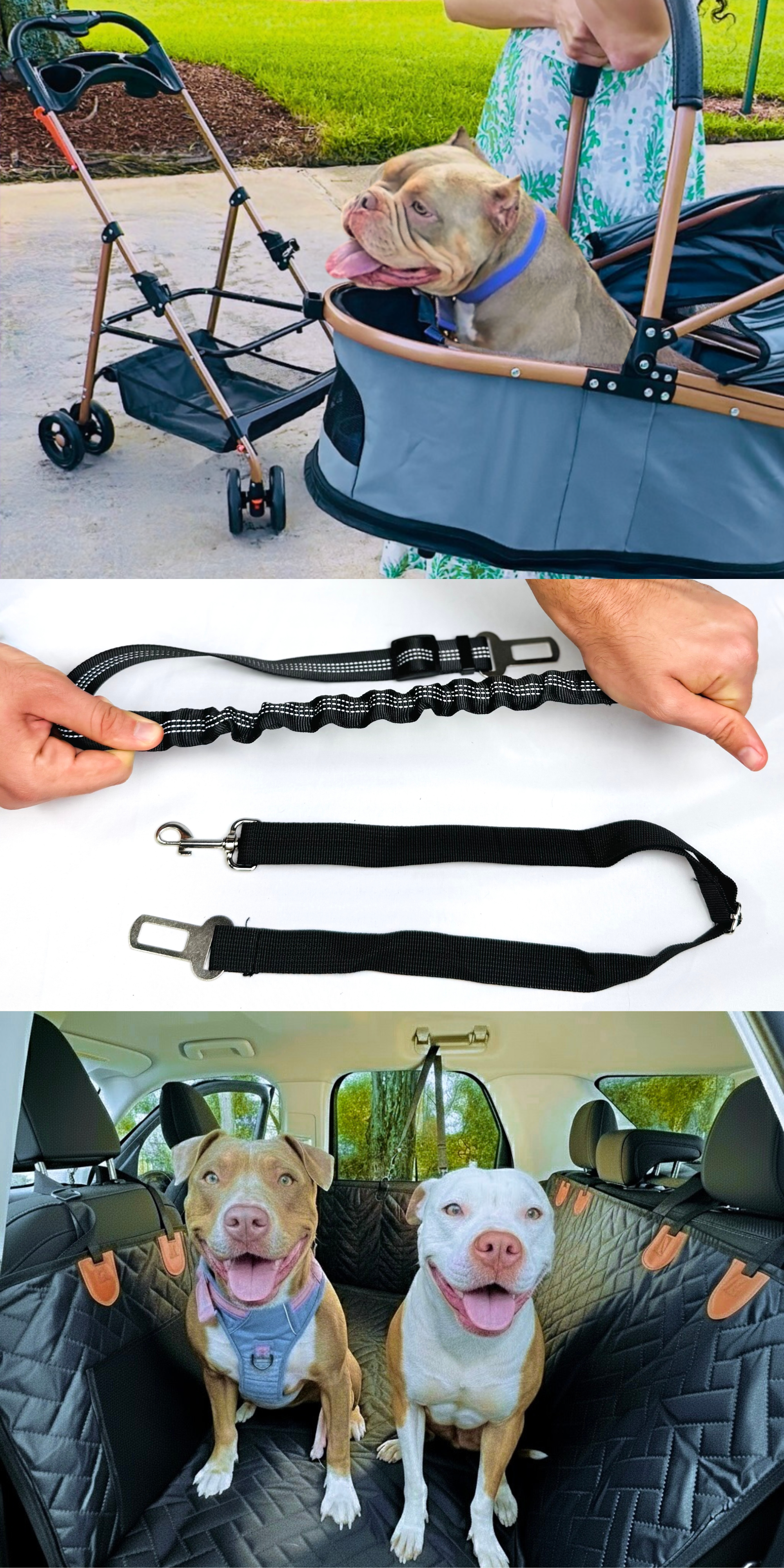
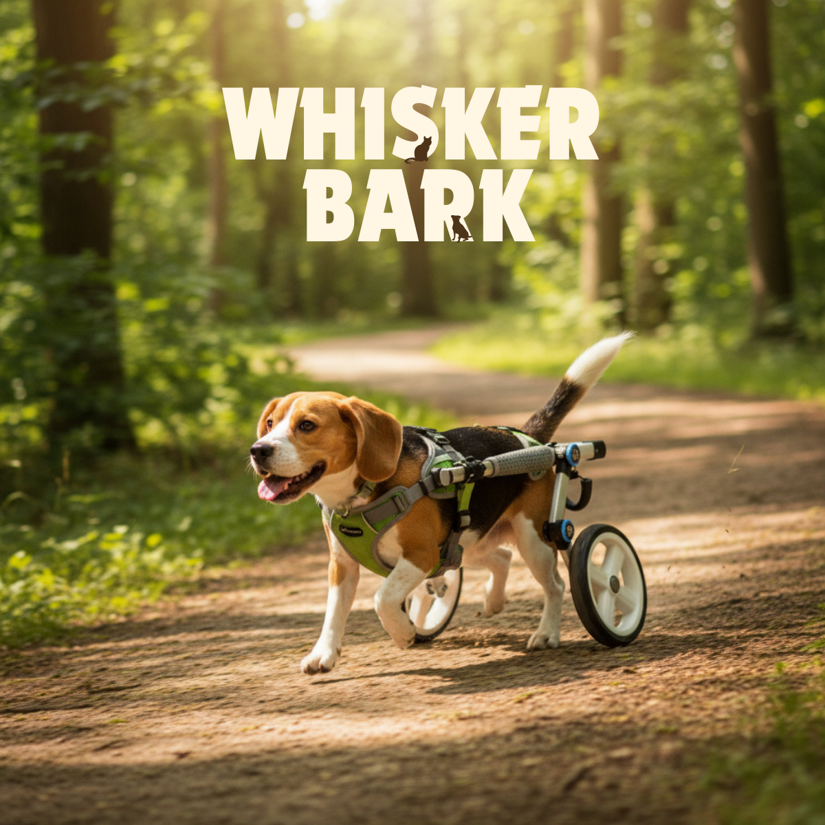
Lifestyle-driven pet accessories brand positioned at the intersection of safety, adventure, and playful storytelling.
A social-first pet brand built around safety, adventure, and playful storytelling—designed to perform across content, commerce, and community.
The pet accessories market is crowded with products that either over-index on utility or lean too heavily into novelty. Whisker Bark needed a brand system that could clearly communicate functionality and safety while still feeling playful, social-first, and emotionally resonant with modern pet parents—especially across fast-scrolling platforms like Instagram and TikTok.
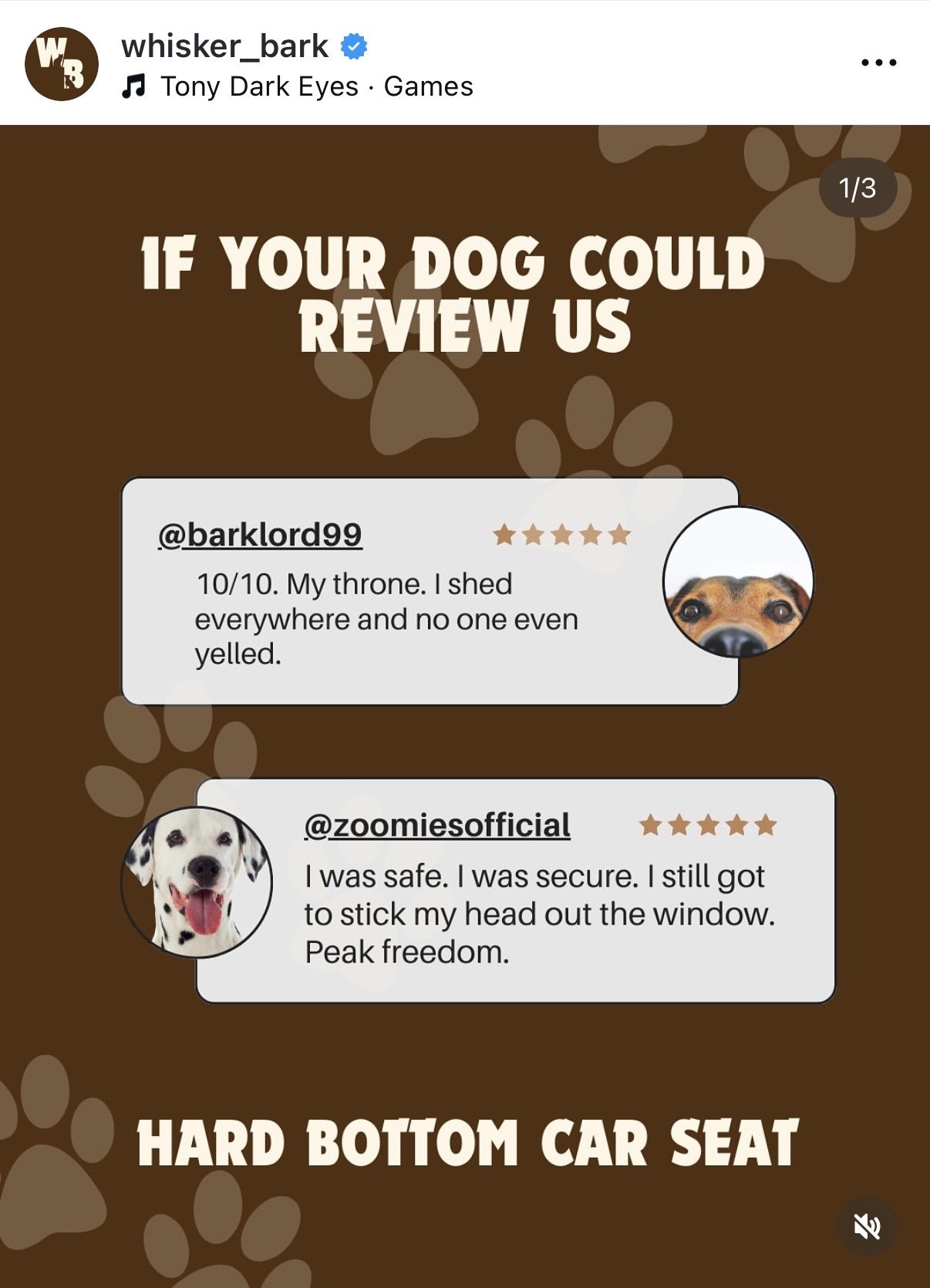
Pet owners increasingly treat their pets as extensions of their identity. They look for brands that balance real problem-solving (safety, durability, comfort) with shareability and humor. Content that performs best in this category humanizes the pet experience—using storytelling, relatability, and lighthearted wit—while still reinforcing trust in the product.
Whisker Bark’s brand system blends adventure-driven lifestyle imagery with UGC-inspired content and playful copy to create an approachable yet credible presence. The visual language highlights pets in motion—traveling, exploring, riding safely—while modular product callouts reinforce key functional benefits.
Partnered for: Brand Strategy, Creative Direction in photography, copy, social video.
Created to support guest-facing touchpoints
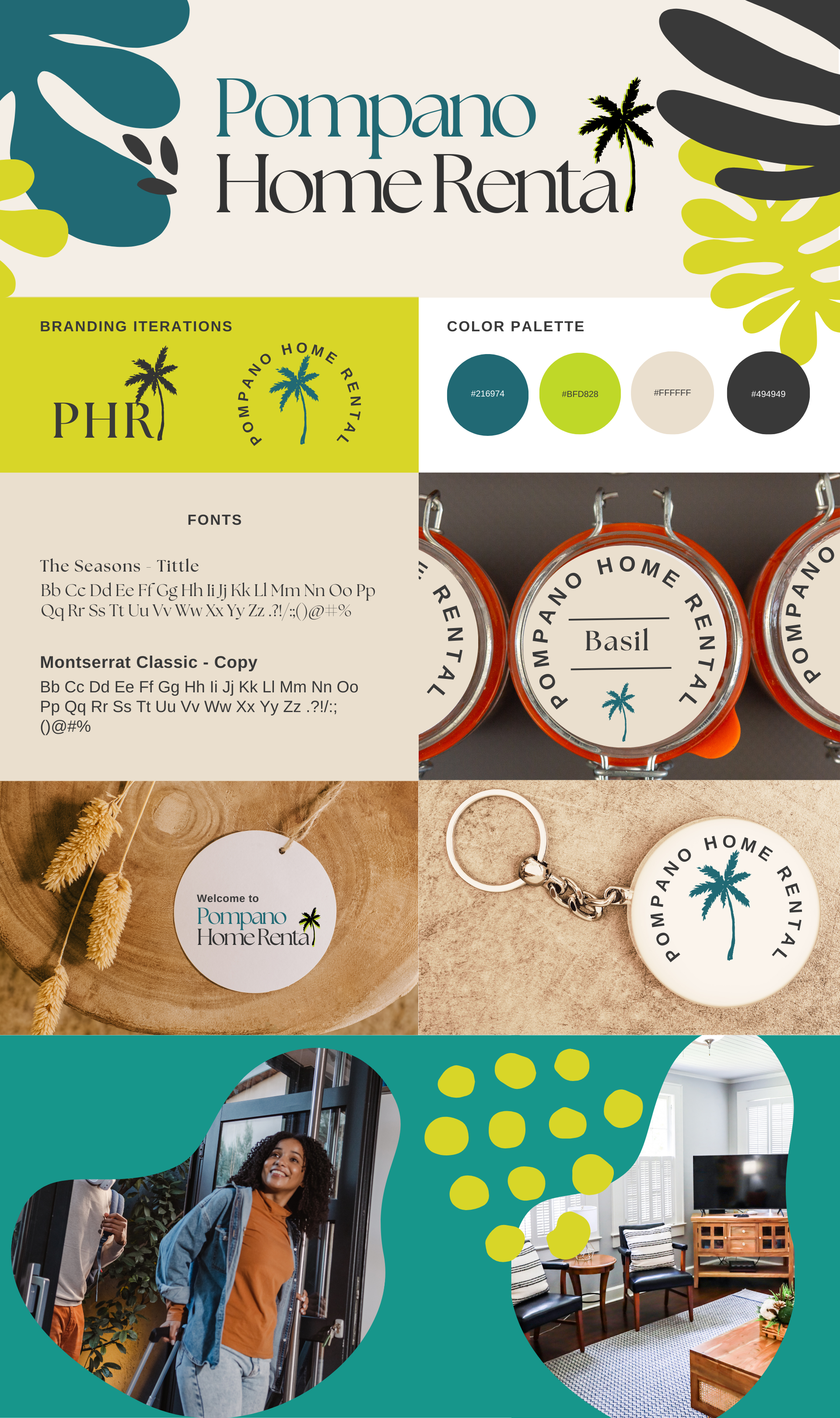
Pompano Home Rental is a hospitality-focused rental brand designed to elevate the short-term stay experience through warmth, clarity, and a strong sense of place—from digital listings to in-home details—while feeling welcoming, trustworthy, and distinctly local.
The identity system balances modern hospitality cues with subtle tropical references, creating a brand that feels professional yet relaxed. Every element was designed to enhance the guest experience before, during, and after the stay—reinforcing comfort, ease, and memorability.
Short-term rental brands often rely on generic visuals and inconsistent branding, making it difficult to stand out or build guest trust before arrival. Pompano Home Rental needed an identity that could communicate professionalism, warmth, and local character—while remaining flexible across listings, print materials, and in-home applications.
Guests don’t just choose a place to stay—they choose a feeling. Rentals that perform best feel intentional and cared for, using cohesive branding to signal reliability, comfort, and attention to detail. A strong sense of place builds emotional connection and sets expectations before a guest ever walks through the door.
The Pompano Home Rental identity blends clean typography with tropical-inspired graphic elements to reflect its coastal location without leaning into clichés. A fresh, sun-washed color palette conveys ease and warmth, while a refined serif headline paired with a modern sans-serif supports clarity and trust.
The system was designed to scale seamlessly across digital listings, welcome materials, branded amenities, and in-home signage—creating a cohesive, guest-centric experience that feels both polished and personal.
Partnered for: Branding, Visual photography direction, and listing copy.
Rooted in calm, nature
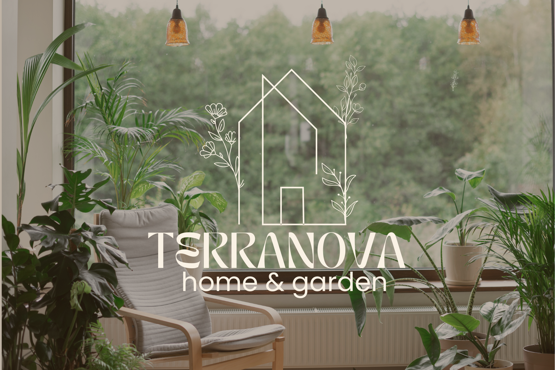
Terranova Home & Garden is a modern, nature-inspired home goods brand built around calm, intentional living. The identity blends minimal architecture with botanical elements to reflect the harmony between home and nature. Soft neutrals, refined typography, and an adaptable visual system position Terranova as an elevated yet approachable lifestyle brand designed to grow across products and platforms.
Terranova Home & Garden needed a brand identity that could stand out in an increasingly saturated home goods market—one dominated by fast trends and overly styled aesthetics. The challenge was to create a visual system that felt elevated yet calming, capable of supporting a growing product line while communicating warmth, authenticity, and longevity rather than disposability.
The Terranova identity was designed as a balance between structure and nature. A minimal line-drawn home icon establishes clarity and stability, while hand-inspired botanical elements soften the system and reflect organic living. A neutral, earthy color palette and refined typography create a timeless foundation that lets lifestyle imagery and products take center stage.
Toay’s home goods consumers are not just buying products—they’re buying a feeling. They seek spaces that function as sanctuaries, blending modern design with natural elements to support slower, more intentional living. Brands that succeed in this space feel quietly confident, allowing nature, materials, and atmosphere to speak louder than overt branding.
The result is a flexible, scalable identity system that feels grounded, serene, and premium—positioning Terranova Home & Garden as a lifestyle brand that invites customers to slow down and create spaces that feel both intentional and deeply personal.
Partnered for: Brand Strategy, creative direction and product expansion.
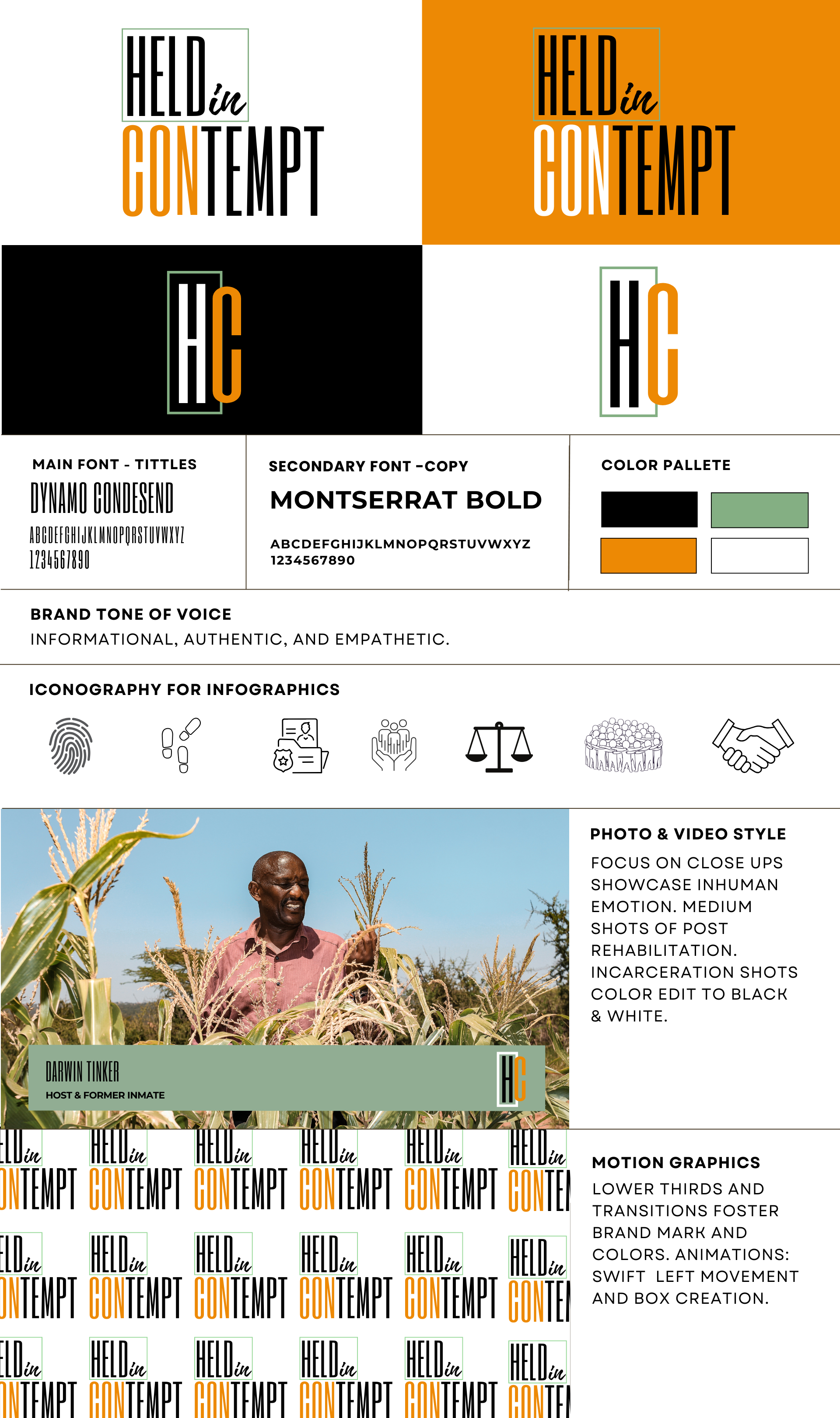
Held in Contempt is a justice-focused media platform dedicated to illuminating the human impact of incarceration and the complexities of post-rehabilitation life. The brand was developed to support long-form storytelling, educational content, and advocacy-driven media.
The identity system was designed to serve as a neutral but powerful container for difficult conversations, ensuring the subject matter remains central while the brand reinforces credibility, empathy, and respect.
Media platforms addressing incarceration often struggle to balance emotional storytelling with journalistic credibility. Overly dramatic visuals risk sensationalizing lived experiences, while overly sterile systems can distance audiences from the human reality behind the issue. Held in Contempt required a brand identity that could communicate gravity, empathy, and authority—without overshadowing the stories being told.
Audiences engage more deeply with social justice content when it feels human, grounded, and trustworthy. Visual restraint, intentional typography, and consistent systems signal seriousness and care—allowing the stories, voices, and lived experiences to lead rather than the brand itself.
The Held in Contempt identity was built around strong typographic contrast, minimal color usage, and modular systems designed for clarity across video, digital, and educational formats. A bold condensed headline font establishes authority and immediacy, while a clean sans-serif supports readability and accessibility.
Muted tones paired with high-contrast black and white photography create a visual language that feels sober and respectful. Iconography and motion graphics were designed to support informational content—such as timelines, legal concepts, and personal narratives—without distraction.
The result is a scalable media identity that reinforces trust, elevates difficult conversations, and centers the humanity of the individuals behind the stories. it stand out.
Partnered for: Branding, Creative direction for visual effects, a-roll and broll and pre-production coordination.
Balancing emotional depth with clarity, trust, and editorial integrity